Wednesday, February 28, 2007

11. Book Initial Ideas


In class


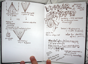
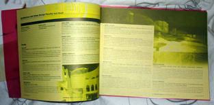
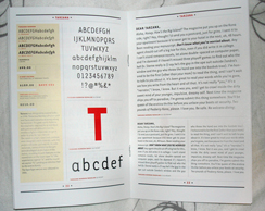
Today we started working on our books and had some initial ideas. Here is what I came up with:


Some other ideas I want to incorporate are the inclusion of stickers so people can interact with the book, just like the internet and make it really their own.

Monday, February 19, 2007

10. Poster Critique Continued


In class


In class the poster critique continued with brief guest critique by Willem Henri Lucas. The talk with my new poster (below) had much to do with the idea of it being a series and that would make or break the posters. They weren't strong enough to be single pieces so I have to work on the other pieces in the series very carefully. Also, the bleeding of the text into my hair makes it practically impossible to read. Prof. Mendez also gave the great point that the the image creates a very strong cross and that placing the small text on my forehead makes draws the viewer closer to the text so I have to move it to the bottom.


Out of class


some of the poster photographs:


Monday, February 12, 2007

9. Poster Critique


In class


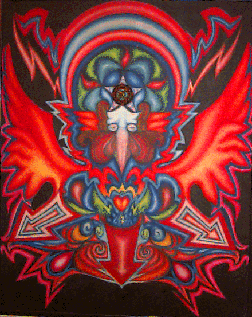
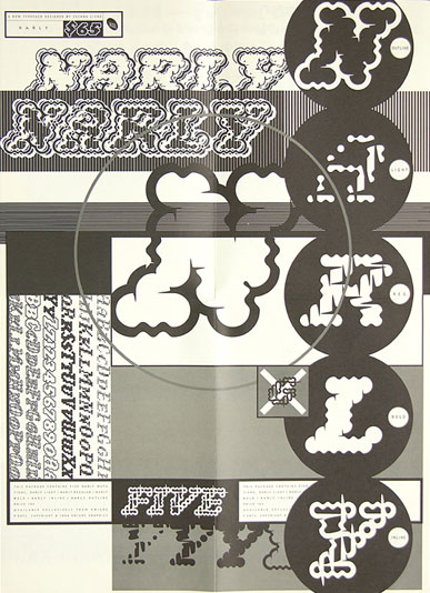
The critque mainly focused on the singularity of using Andy Goldsworthy. During the critique the conclusion was made that while visually stimulating his artwork doesn't exactly capture the plurality of the concept of the internet. He only uses one kind of an object at a time and as a result it's too uniform which is not what I'm trying to say the internet is. As a result, I'm on the move to make a different poster design. Here's something to help with inspiration:
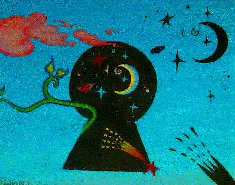
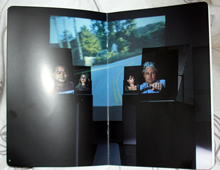
the new poster


In the public eye.


Out of class


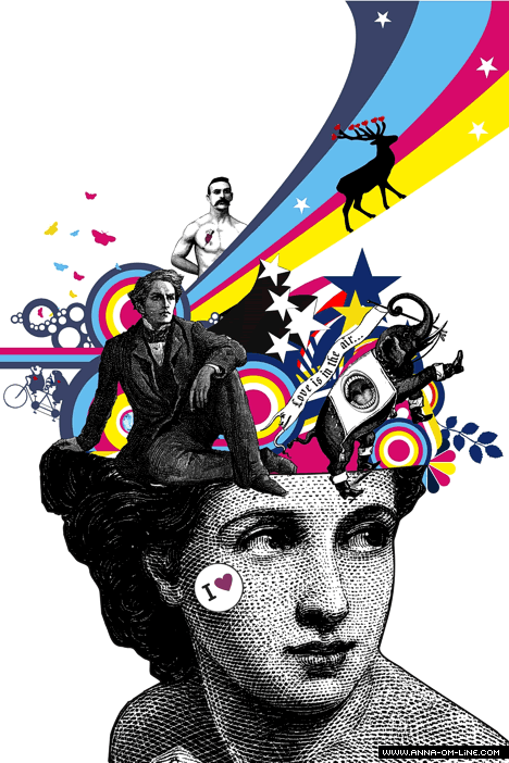
So after talking with Prof. Mendez in office hours we came to the decision of PLURALITY. I would do this through the survey that I've been asking so many of you kind people to fill out. Here is preliminary in a line of posters dealing more with the additive singularity of perspectives within the internet.


clicking will bar an even larger pdf so that you can read the text which is just a quote from Howard Rheingold's essay on optimism. In the Box with the x there will be a little card. Pictures to come soon.

Sunday, February 11, 2007

8. Preliminary Poster Design


In class


Lecture on contemporary photographers. My favorite certainly being Teun Hocks. Incredibly interesting photographer and perfoming artist.


I had never heard of him before and his work is incredibly compelling by the way he shoots his self-portraits. There is definitely a feeling of restrained kinteic energy in his pieces.


Out of class


First set of posters. They fit together. Still working some things out:


The horizontal piece is twice as long as the two vertical ones and they can be put together as the two vertical next to each other and the horizontal on top or below. As said before, still working things out. Each image can be clicked for larger versions. Highest quality (600 dpi) photographs found in actual prints, not on blog. This is because each file is around 100 megs. Sorry...

Tuesday, February 6, 2007

7. Synthesis Boards


In class


Today we got our mood boards critiqued. For mine, I opted to use Andy Goldsworthy imagery because I feel it relates to my subject incredibly well. He uses nature, found art and creates something profound, something so much more than just the sum of its' parts. This is much how I feel the internet works. It is everyday and is there for anyone to take advantage of. With that said here are the synthesis boards:


I think for the posters I'd be interested in making 3 iterations that somehow come together to make a much bigger poster. In 3 parts (nets)!


Out of class


Looking up poster designs. Here are some of my favorites:

Anna-Om-Line


We Work for Them


The Small Stakes


idN


Dress Code Does Design


Lysergid


Monday, February 5, 2007

6. Mood Boards


In class


Mood Boards were presented to the class. Hanging was at 9am, critique lasted roughly 3 1/2 hours. Below are my mood boards.


Out of class


What I took away from the critique were very interesting comments. First the idea that the internet as this huge open space or some amorphous technological string is a bit played out. The Internet Revolution is over and the internet is here and now. It's in coffee shops and it is everyday. But more importantly more than creating the illusion that the internet is some crazy huge 2nd world it's really condensing spatial relations. For instance I can be in a coffee shop and also watching the latest sports game on ESPN, or the current events in Japan, halfway around the world. I can be in these places all at once because of the internet. So, with that said, I am going to focus on finding a contemporary photographer that illicits these same ideas.

Some other contemporary artists' work I am considering:

Tjasa Owen


Pilimo


Andy Goldsworthy

Monday, January 29, 2007

5. Survey


In class


The internet is your ______ .

Please comment your response

Wednesday, January 24, 2007

4. Concept


In class


Internet as Utopia?

That was the concept that I had coming into class today. With the works of Rheingold and Moore I came to see two ends of a spectrum. While these two methods of communication are vastly different in their purpose the internet has no qualms harboring both sides completely unbiased. This is why I believed the internet was the new utopia. However, if clicking the link and based on what Professor Mendez commented on is that utopia in its essence is something that does not exist. It is an ideal. This inherently drives something less optimistic than desired and Professor Mendez opted that I look into more the openness of the internet through the ability of Open Source.

TA Chris O'Leary advised that it may be wise to try to talk about my perspective and my own thoughts about the internet, instead of trying to reach an overarching broader sense of what is internet. Other findings include two font faces that I really like, found below:

Cholla published by Emigre

I believe this font face fits perfectly because it is a nice ledgible type. A san serif which are ledgible even at very small type sizes. The actual form of the letter however reminds me of a digital watch where curves are few and subtle. Most notable in the S where it looks similar to a 5. also the taper of the curves in the letters p and r remind me of that digital watch feel while still being very classical. Something that I feel fits the internet very well.

Narly published by Emigre

I enjoy Narly more because of its ideosyncratic nature which is also very much how the internet can be used. Also, the face is based on the sum of many circles, much like many little servers to create a network or in the case of the font face the actual letter.


Out of class


readings from the syllabus.


Tuesday, January 23, 2007

3. Rheingold vs. Moore?


After doing a fair amount of websurfing the idea came into my mind that the viewpoint of Howard Rheingold is a very optimistic idea of the small person voicing his/her opinion and actually getting heard. Alan Moore agrees with this in many cases as he even writes an article in his website. However, Mr. Moore's job is quite the opposite as he works on advertising. What advertising is better than the huge corporate multi-national company? In its essence the exact opposite of what Mr. Rheingold believes. Below are a few examples.


Rheingoldian Communication:


"YouTube War" in Iraq


NYC's real problem


For just an instant in time these works are revered as something more than just what they are. They become famous for that moment and by association those authors claim fame.


Moore Advertising:


Get to know Kelly Clarkson
Now you have the ability to know Kelly Clarkson!!! OMG!!! You get to be personal friends with somebody uber famous like Kelly Clarkson

You Witness News (Yahoo)
Now's your chance for Yahoo! to capitolize on your hard work in capturing interesting events!

Hopefully the satire is clear, but to elaborate. These power of local forums and gorilla marketing run deep. There are various degrees and the ability for huge icons to feel so close you can touch them is another. I think it's an interesting juxaposition between that of optimist Howard Rheingold.

The thought process as seen on my sketchbook January 17th, 2007:


2. The Decision: Howard Rheingold


In class


Meeting number two involved the presentation of a specialist that interested the student. For me, I chose Howard Rheingold. His reasons for optimism are incredibly compelling to me for two reasons: he is optimistic about my generation and about the internet. This combination is formulated into a formal essay. In a nut shell what Mr. Rheingold vies for is a world where civic duty has come back into the forefront of this generations' concerns. This is done through the internet where people not only take information away, but also through blogging, YouTube, Text Messaging, and others people also put information back into the internet. This has created a new kind of community he states.

When presenting this idea one person too came up in this construct, Alan Moore. He spoke at UCLA Spring 2006 and I had the honor of attending that lecture. His work involves embracing the internet and internet communities, forums, etc. and applying that to advertising. One comment that struck me during his lecture


Out of class


More research in Howard Rheingold and reviewing the lecture by Alan Moore. Some interesting things found through the research:

YouTube for your Mobile unit
Rheingold's Smart Mobs

Rheingoldian Art

Monday, January 22, 2007

1. Intro: Meeting I


In class:


Overview of class 154a: Communication I with Professor Rebeca Mendez and T.A. Chris O'Leary. The class, from what it seems is a comprehensive class involving our research and execution in identity through an idea. Ideas are to be chosen through allying one's own opinions on website Edge.org.

This blog's intention is to be used congruently with the in-class work produced. It is the process of Jonathan Brandel's work for 154a.

Professor Mendez went over some examples she has worked on with Typography. Included are things that she has shown and other typographic trinkets I enjoy:

Architecture UCLA Admissions Booklet 1998


Art Center Postcard 1990


Digital Medias Booklet 1995


some of my favorites:

Bay Area Rapid Transit Ticket 2006


Emigre Font Foundry Type Book 2006


LinoType Poster 2006


Other things worth mentioning:
Adjunct Faculty Member N. Katherine Hayles


Out of class:


Look up on Edge.org and choose a person. So far I have my eye on three different specialists and their personal views on what makes them optimistic:

Howard Rheingold
Alun Anderson
James O'Donnel